The do’s and don’t for Infographic Design

The ‘infographic’ has been a go-to for marketing teams and social media experts for many years now. But like any branding mechanism that falls into the wrong hands; if something can go wrong, it invariably will. This is regrettably the case for the humble infographic, which is linked to an extensive list of horrendous design crimes.
Simplifying data… right?
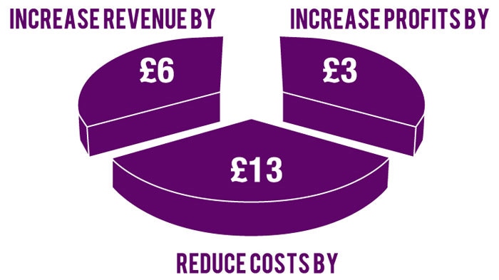
The issue lies in the purple slice of the pie.
It only takes a 3-year diploma to understand this immediately.
After decades of being pigeonholed into Microsoft Excel pie charts and column charts, infographics flourished throughout the 00’s as a way to reduce content and attract viewer interest. Unfortunately, these graphics have taken the wrap for poor execution in recent years. But there is still a chance of a reprieve. In the right hands, they can be a force for good, fighting the perils of complex data-rich tables for years to come.
An ‘Infographic’ is a representation of information in a graphic form, designed to make data instantly understandable.
Infographics are doubly important for startups as they help consumers get to know the business and familiarise themselves with the brand. Here a few do’s and don’t when creating infographics that communicate quickly, effectively and aesthetically.
Don’t try to fit a square peg into a round pie chart
Many ideas for infographics start off harmlessly creative; often developing around an object or a branding element. However, as the artwork takes shape, the concept begins to appear cluttered, or the data becomes difficult to understand. Remember an infographic’s primary purpose: to make complicated information more easily digestible. Sit back and think, does the application make sense? If not, it’s time to head back to the drawing board.
Do create a story
Just like an engaging piece of writing, your infographics need to tell a story. If you’re just banging out any old statistics, to beautify the rest of the document or web page, you need to rethink your strategy. Having imagery, infographics and text all working together strengthens your message, on top of your brand.
Don’t ignore the power of graphics
Sometimes it might feel a bit too hard to pull it ‘all’ together. Finalising text and scrounging together images can be an effort in itself (this is not how the way you should view the process by the way). So adding more elements into the mix can feel all too much. You must persist! These few extra ingredients add a distinct flavour to your overall business branding package.
Do invest in someone who knows what they’re doing
As we’ve warned ad nauseam, engage professionals to undertake your business branding and marketing. It’s just good business sense, and creating infographics for your business is no exception. A quality graphics output in the initial marketing stages can be the difference between winning and losing potential clients.
Clients searching for products or services are more likely to invest if they can quickly and easily digest information. Creating infographics for your business is an easy way to help speed up this process.
Let's start a conversation
Contact us today if you have any questions or would like to start the journey. Our friendly and experienced team are here to help!