I need how many logo variations?!

‘All I want is a logo, why have you sent me all these variations?’
We sometimes get this question from clients when sending them ‘the next’ round of logo proofs. The simple truth is, no brand should have just ‘one’ logo. Yes, brandmarks should all be the same, but, depending on the specifications, the placement of elements should differ. Think of it like trying to fit a round peg in a square hole; you can either force it in until it breaks, or redesign it so it fits seamlessly.
What is a logo variation?
A logo variation is a modified version of your primary logo, which can be utilised in specific applications. Often, due to size, colour or proportional restrictions, a secondary logo will need to be applied to make the design function. Unfortunately, the world isn’t black and white and every business should possess a comprehensive suite of on-brand logo variations. These versions include, but are certainly not limited to:
- Horizontal
- Vertical (Stacked)
- Icon (Brandmark) only
- Text (Logotype) only
- Monotone
- Reversed
Won’t my brand look disjointed with so many logos?
It’s important not to think of the variations as ‘different logos’, but merely the same design with slight tweaks; inconspicuous to the sub-conscious.
Your brand style guide will also give you a clear direction on when and where to use which logo. So, you don’t need to worry about making a mistake with your logo suite.
What’s the worst that could happen?
Alright, let’s try out a couple of examples.
You’ve decided to roll with just the one logo; the standard and most implemented ‘colour logo on white background’. Brave decision! It works well on your business card and letterhead, social media applications look good; you can even squeeze it into your website header. Now, time to arrange some pens for an upcoming conference… baaah bum. The elongated nature of the surface means that you can’t simply compress a logo onto that area. Not to mention most pens come with a coloured background.
‘But we’re an online company, we’re unlikely to have pens made.’ Alright, fair enough. Next scenario.
You’ve increased your business to such a stage that you’re beginning to sponsor major events and organisations to attract further interest. Congratulations, it’s a huge step forward! However, now you’re giving your brand resources to the enemy; external designers. They may need to apply your logo to canvas bags, signage, websites, posters and booklets, all in their own style. Trust us, you don’t want to be ‘that’ company with the squished logo or their brandmark shoved in a dorky white box. Have logo alternatives
Let’s see a timely example
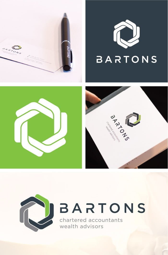
As always, a picture tells a 1000 words. This branding example that Argon completed for Bartons in 2017 gives you some idea about the versatility of the professional corporate logo.

Plenty of variations! And there’s more where that came from.
Is your logo adaptable enough to suit all situations? If not, it might be time to add to your brand package. We recommend every brand utilises logo variations so that their business brandmark can fit into every format or atmosphere possible.
Let's start a conversation
Contact us today if you have any questions or would like to start the journey. Our friendly and experienced team are here to help!

